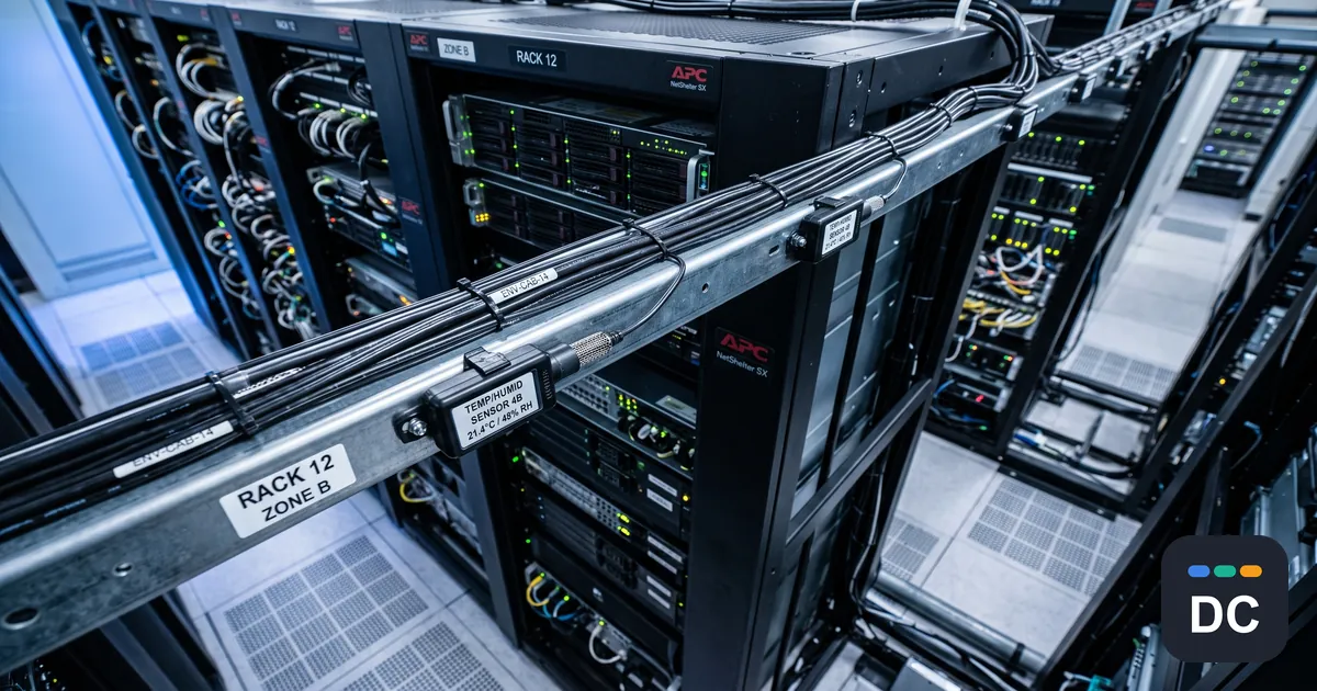
The short version: Every buying guide for data center monitoring solutions compares the same things: how many sensor types, how many protocols, how good the dashboard, how flexible the alerting. None of them print the one number that sets a hard ceiling on what the system can ever detect, which is how often it actually reads the point. A platform that polls every five minutes is not a slower version of one that polls every five seconds. It is a different instrument, blind to an entire class of events.
What every guide to data center monitoring solutions already covers
Read the top-ranking pages on this category and you get a consistent, correct, and incomplete picture. Monitor the physical layer: inlet and outlet temperature, humidity, differential pressure, airflow, leak detection under the floor and around the coolant loops. Monitor the electrical layer: UPS state, branch circuits, PDU outlets, kWh. Integrate over SNMP, Modbus, BACnet, or MQTT so the facility gear and the IT gear land on one screen. Set thresholds, route alarms, keep history for capacity planning.
That is the table stakes, and it is genuinely what the category does. The problem is that it describes coverage in space (which points are wired) and says nothing about coverage in time (how often each point is read, and what happens to the reading afterward). Two products with identical sensor lists and identical dashboards can differ by two orders of magnitude in temporal resolution, and nothing in the comparison table will tell you.
The sample rate is the spec sheet infrastructure monitoring vendors do not publish
A monitoring platform is a sampled data system, and sampled systems obey a rule that predates data centers by decades: you cannot reconstruct a signal that moves faster than your sampling rate. Whatever happens between two samples did not happen, as far as your data is concerned.
Apply that honestly. ASHRAE’s thermal guidelines put the recommended server inlet envelope at 18 to 27 degrees C. Suppose a cooling unit drops out and the racks it served run hot for two minutes before the standby unit picks up the load. If your platform polls inlet temperature every five minutes, that event does not show up as a small excursion. It very likely shows up as nothing at all. Your report says the hall stayed inside the recommended envelope. Your IT equipment experienced something else. The report is not wrong about the samples. It is wrong about the room.
Power is faster still, and it is where the stakes concentrate. Uptime Institute’s Annual Outage Analysis has for years put on-site power problems at the top of the causes of impactful outages, most often traced back to the UPS. Electrical events do not politely hold still for a five-minute poll. Inrush on a motor start, a load step when a workload lands, a transfer event: these are second and sub-second phenomena. A protective device does not average. A breaker trips on a current-versus-time curve that responds to what the current actually did, not to its five-minute mean.
Which produces the quiet absurdity at the center of a lot of capacity work: the branch circuit is provisioned from averages and protected against peaks. A circuit reported at 60 percent utilization on five-minute means can be touching its trip curve regularly, and every number you have says you are comfortable. The first time you learn otherwise is the trip.
Alarm thresholds report the past; the trend moved first
A threshold is a step function evaluated against a sample. It answers one question, late: has the thing already gone wrong? By the time a rack inlet crosses its high limit, the airflow problem that caused it has been developing for a while, and it was visible the whole time in a quantity nobody alarms on. The delta between inlet and outlet temperature on a rack tells you whether that rack is getting the air it needs, and it drifts before any absolute temperature breaches anything. The same is true on the electrical side: a slowly rising per-circuit draw is a capacity conversation you can have on a Tuesday, and a threshold breach is a capacity conversation you have at 2am.
None of that requires a smarter dashboard. It requires enough temporal resolution that a trend is a trend and not a scatter of six data points an hour, which is what a five-minute poll gives you, and which is not enough to separate drift from noise on anything that matters.
Averaging and data rollup automatically delete your evidence
Most platforms downsample as data ages: full resolution for some days, then hourly averages, then daily. This is a sensible storage decision and a terrible forensic one, because averaging is lossy in exactly the direction you care about. The peak that tripped the breaker is, by construction, the thing an average removes.
So the post-incident review opens the history, finds a smooth line, and concludes that nothing anomalous preceded the event. What it actually found is that the evidence was aggregated away, possibly before anyone went looking. This is the most under-asked question in the category: for how long is raw data kept at full resolution, and can you export it? If the answer is “we keep a year of history” with no resolution attached, you do not have a year of history. You have a year of shapes.
Six questions worth putting to a DCIM or environmental monitoring vendor
Each is answerable in a sentence, and the answers separate products the feature matrix calls identical.
- What is the actual poll interval, per metric class? Not the fastest the product supports in a lab, the interval you would run in a hall of this size. Temperature, power, and leak detection may well have different answers.
- Is it configurable per point? You do not need five-second data on room humidity. You may badly want it on a branch circuit feeding a dense rack.
- Is anything event-driven, or is it all polled? A device that pushes a state change the moment it happens is not bounded by the poll interval. A device that waits to be asked is.
- How long is raw data retained before rollup, and what does rollup do? Averages, or averages plus min and max? Keeping min and max preserves the peak, and it is a cheap fix that many platforms simply do not offer.
- Where do timestamps come from? If the PDU and the temperature sensor are not synchronized to a common clock, correlating a power event with a thermal event is guesswork. Causality is a timestamp problem before it is an analytics problem.
- Can you get the raw data out? Full-resolution export is what lets you answer a question the vendor’s dashboard was not built to ask.
How to read the data center monitoring solutions market from here
The category competes on breadth because breadth is easy to put in a table. Sensor types, protocols, integrations, dashboard widgets: all countable, all comparable, all largely commoditized. Temporal resolution is none of those things, which is exactly why it is where the real differences hide.
Rack densities are climbing, and density compresses timescales. The higher the power in a rack, the less thermal slack sits between a cooling anomaly and a consequence, and the more of the interesting behavior lives inside the interval a legacy poll rate cannot see. An approach that was adequate for a 5kW rack is not automatically adequate for a 50kW one, and nothing in the product description will announce the difference.
The buying question is not “what can this platform monitor.” Almost all of them monitor almost everything. The question is “what can this platform see,” and the answer is bounded by a number that is not on the datasheet. Ask for it.
Leave a comment