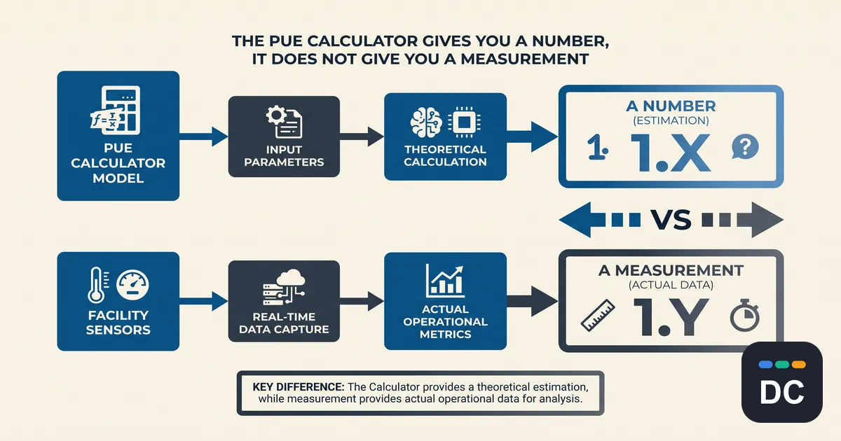
Summary: A PUE calculator does arithmetic; however, the math was never the hard part. Power usage effectiveness is a measurement protocol, but the conditions that protocol turns on are the three things no calculator asks: where you metered the IT load, over what period you recorded it, and how full the hall was while you did. This output is a real number about your facility.
What a PUE calculator actually computes
Every PUE calculator ranking on page one does the same thing. You supply the total facility energy and the IT equipment energy in kilowatt-hours, divide the first by the second, and map the result to a band. Roughly 1.0 to 1.2 is considered world-class, under 1.5 is considered good, and above 2.0 is considered a problem. Several add a list of generic remedies about airflow, containment, and cooling setpoints.
This is not wrong. But the division is the trivial step. What the tools skip is that the metric was never specified as a formula in its own right. It was specified as a formula plus a set of conditions governing how those two inputs are obtained, and the conditions are where the number acquires or loses its meaning.
Where you meter decides what you get
The Green Grid defined the metric with measurement categories, examined at length in the LBNL-hosted white paper PUE: A Comprehensive Examination of the Metric. The categories differ on one essential point: where in the power chain the IT load is measured.
- Category 1 takes IT load at the UPS output.
- Category 2 takes it at the PDU output.
- Category 3 takes it at the IT equipment input.
Between the UPS output and the PDU output are transformer and distribution losses. Between the PDU output and the equipment input sit cabling and, depending on topology, further conversion. Each step down the chain strips another slice of loss out of the denominator.
A smaller denominator produces a larger ratio. The same building, metered on the same day, reports its best PUE at Category 1 and its worst at Category 3. The more granular the measurement, the more honest the result, which means the facility that invested in better instrumentation is the one whose published number looks worse.
A PUE calculator that accepts “IT equipment energy” as a single, unlabelled field cannot distinguish among these. Two facilities reporting 1.4 and 1.5 may be ranked in the wrong order simply because they were metered at different points.
A ratio needs a period attached to it
ISO/IEC 30134-2, the international standard for power usage effectiveness, requires facility energy and IT energy to be recorded over a coincident 12-month period. Both conditions carry weight. Coincident means the two figures cover the same span. Twelve months means a full annual cycle.
The reason is seasonality. Mechanical load tracks ambient conditions, so a facility using outside air or evaporative assistance can post an excellent ratio in February and a mediocre one in August without anything changing in the building. A PUE calculator fed one month of billing data returns a number that is mathematically, although arbitrary, for that season. Feed it a spot reading, and the position is worse still.
The denominator changes, and it moves the PUE
PUE is load-dependent because much of the facility overhead is fixed. Cooling plant, power conversion, lighting, and controls do not fall in proportion to IT load. This fixed overhead is spread across a smaller IT figure, and the ratio climbs.
A half-filled hall can post a worse PUE while consuming less total energy than a full one. A PUE of 1.5 at 30 percent IT utilisation and a PUE of 1.5 at 90 percent illustrate two very different buildings which the PUE calculator does not take into account.
The Uptime Institute Global Data Center Survey 2024 put the average PUE at 1.56, flat for a fifth consecutive year, after falling from roughly 2.5 in the late 2000s to 1.65 by 2014. That sounds like an industry that stopped improving. However, it is down to newer, denser, better-instrumented sites entering the industry alongside partially loaded ones.
What are the online tools good for
None of this makes a PUE calculator useless. It makes it a component rather than an answer.
Used against your own facility, with the metering point held constant and the window held constant, the ratio is a decent trend line. Month over month against last year’s same month, it will tell you whether an economiser change or a containment retrofit moved anything. That is a real and worthwhile use, and it is available to anyone with billing data and branch metering.
It does not support cross-facility comparison unless both sides declare category and period, which they almost never do. And it does not, on its own, tell you where the overhead went. A poor PUE is a ratio that shows a symptom of your data center’s performance. It does not distinguish oversized mechanical plant from a lightly loaded UPS from bypass airflow, and the remedies for those three have nothing in common.
What is the fix?
The fix costs nothing. Whenever a PUE figure is recorded, published, or compared, record three things next to it:
1. The measurement category, or at minimum where IT load was metered.
2. The period, with its start and end dates, and whether the two energy figures are coincident.
3. The average IT load across that period.
A number carrying those three annotations can be compared, defended, and acted on. A number without them is whatever a PUE calculator handed back in seconds. Both look identical on a slide, which is precisely the problem, and it is why the question worth asking about any quoted figure is not “what is it” but “how was it obtained.”
Leave a comment